
Known for its high level of readability, Serif font also offers a more artistic look or certain perceptions through the combination of regular and italic style. When you use them correctly, modern serif fonts with regular and italic characters offer a valuable tool for any designer to attract audiences’ attention.

If a typeface is the “core” design, we can then consider weights and styles as the extensions of the design. They team up to construct the so-called type family (or, simply family).
In the realm of typography, the most basic family typically comprises four variations of two upright weights (regular and bold) and two matching italic styles (also, regular and bold italic).
The term regular style may refer to the regular weight of a typeface. People call it by various names, like upright or roman, as well as non-italic or oblique. It is also called “normal” regarding a type’s width. You can find this style as headlines but it is typically suitable for longer body text.
Meanwhile, the italic style is “the Roman cousin,” usually having a prominent characteristic of inclined or slanted letters to the right side. The common purpose of using this style is to emphasize or distinguish text from its regular counterparts, as well as to indicate foreign words or phrases.
Dating back to its origin, the serif font family can be ascribed to the Latin Alphabet having its letters engraved into stone in Roman Antiquity. First, the carvers painted the Roman words onto the stone and then inscribed them by following the brush marks, adding flared strokes at the ends and corners, and ultimately creating the so-called serifs.
Likewise, a font that has small “feet-like” features at the ends of strokes is named “Serif” or “Serif font.” Some notable Serif fonts include Times New Roman, Garamond, Georgia, Palatino, and more.
Many studies have proven that serif fonts are easier to read as serifs make the individual characters (letters) more distinctive. It leads our brain to quickly recognize and easily read them.
When can you use Serif font to get the best outcome? You may find this sort of typeface mostly used in printed media or typestyle, such as newspapers, books, and magazines. Again, it is because serif fonts have a high level of readability, making your message clearer and more legible.
If we are talking about what serif typeface tells you, people commonly associate this font with some personalities or perceptions like classic, traditional, and trustworthy. If you want your design to be more formal, authoritative, or respectable, it is better to use a serif font.
Now, what about a serif font that has regular and italic style within? It would be a double-kill combo you can expect for your creative design ideas.
Are you looking for a creative muse for your upcoming graphic design projects? You can look up to or try the following modern serif fonts that combine regular and italic styles.
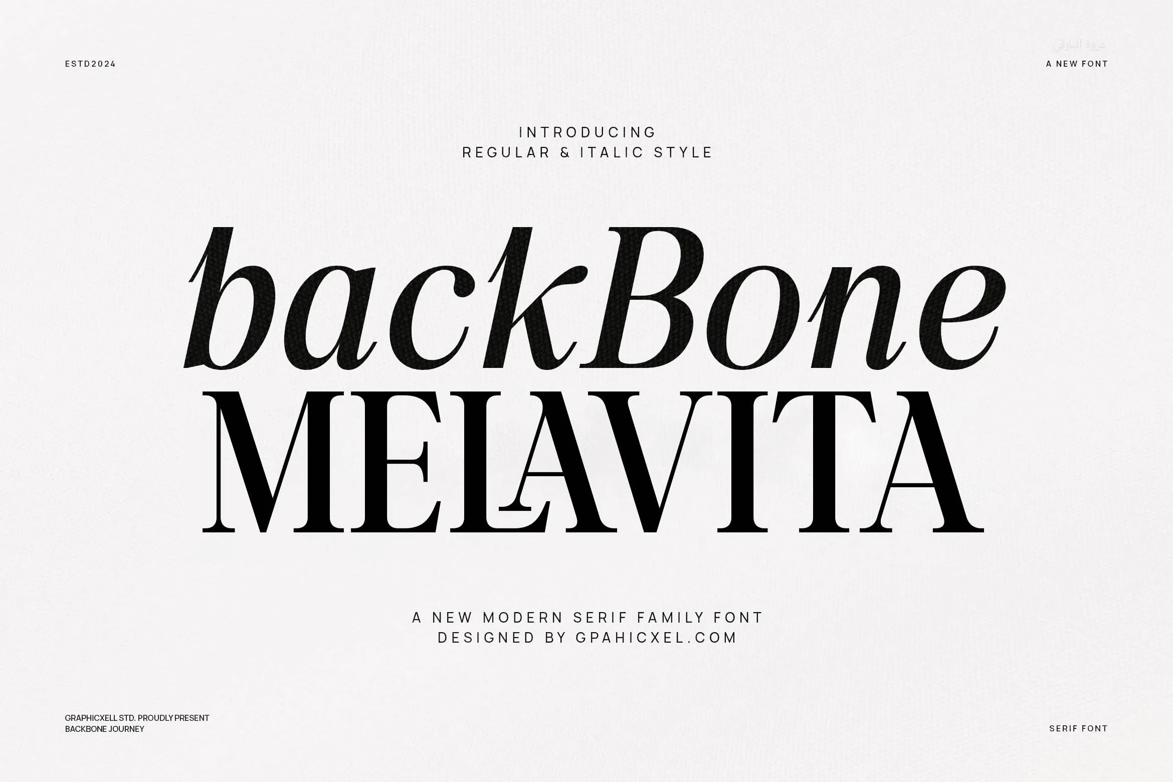
Back Bone Melavita is a modern serif font family that comes in regular and italic style. Despite its small and delicate letters, this font gives a highly sharp look.
The regular style is unquestionably readable, complemented by various artistic thicknesses on each line’s curve. As for the italic style, you will find the strokes are delicately beautiful and classy.
2. Glowins

Its full name is Glowins Minimalist Family Serif Font. It is a modern and elegant serif font that has regular and italic styles within it. If you want a classic characteristic, serif fonts are undoubtedly the perfect choice. They will generate an instant pleasing formal and professional effect to your design. Additionally, the simple and clear letterforms offer a high level of readability.

The next on the list is Mortgage Family Elegant Serif Font Text. It looks lovely and classy at the same time. Both the regular and italic styles propose truly artistic curves and strokes in various thickness levels.
Also, this font is also highly readable, making it perfect for design purposes like headlines, logo fonts, branding, layout designs, and more.
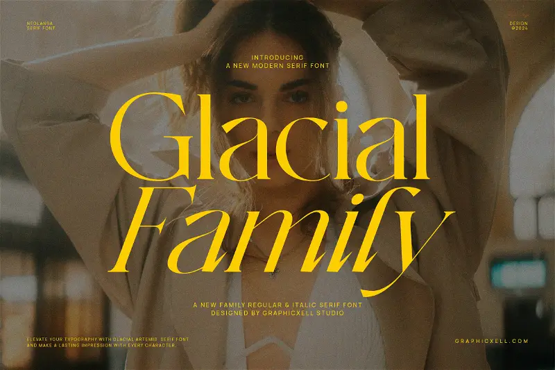
Get your design an attractive and lasting impression through the use of this font. Glacial Family is an elegant modern serif that comes in a combo of regular and italic style.
This font radiates the rich ancestry and history of the Italian typeface as its inspiration. Moreover, the boldness and details undoubtedly reflect bravery. You can see it from the prominent contrast between the thick and thin strokes, vertical pressure, and a thin hair-line serif.

Alsigna Cheska is deeply inspired by the rich history and heritage you can find in the notable Italian type. Something noticeably unique about this font is the reversed diagonal axis style, representing stylishness and enthusiasm all at once.
You can also apply this serif font family if you want to create more expressive text or other graphic design works.
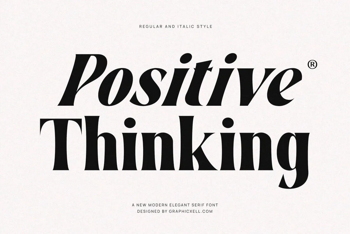
At a glance, you will find Positive Thinking is exquisitely bold, where each character shows a clear contrast between its thickness and thinness levels.
The font features regular and italic versions that are not only versatile but also easy to read. Positive Thinking indeed invokes a stylish and modern flair that is increasingly ideal for present-day design purposes. It is suitable for, among others, cinema graphics, fashion magazines, interior design brochures, Instagram posts, and the like.
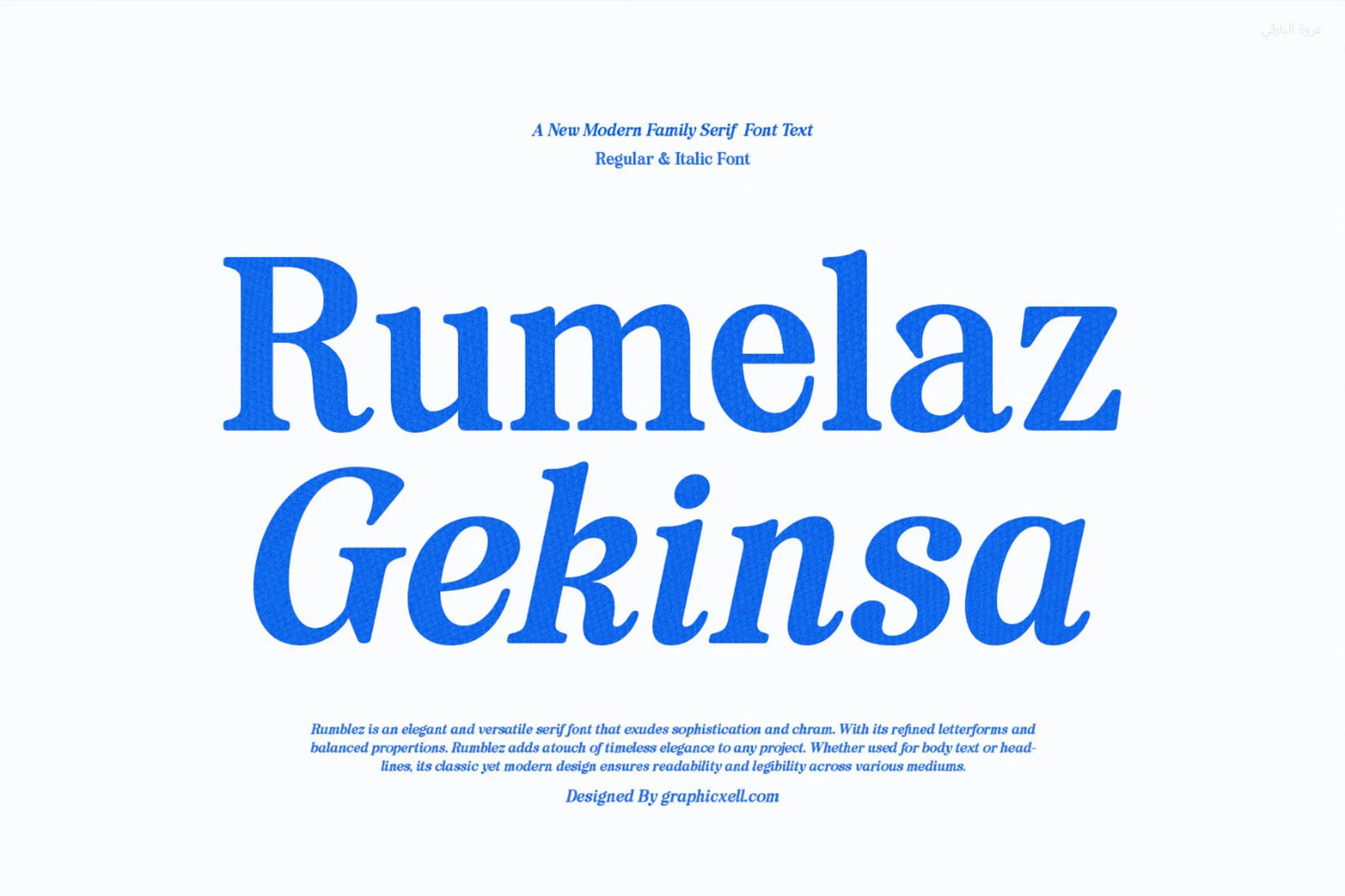
Last but not least, Rumelaz Gekinsa is a modern family serif font available in regular and italic style. You also find this font exudes the retro vibe – or even, 80s to 90s – from the very first glance. Indeed, it has a great combo of classy and modern flair that evokes charm and sophistication.
Serif font with regular and italic style is an ideal choice if you want your design not only formal and trustworthy but also elegant and contemporary. You can use italic characters to emphasize or differentiate your text from their upright counterparts.