
Catching up on trends is crucial in digital design. Not only to attract clients, trends can also enhance your ability to create a design with totally different aesthetics. You are also challenged to combine elements, such as fonts and color schemes to achieve one trendy design. However, there is one font that can be used for a wide range of themes without going out of style, called serif fonts.

The word serif refers to the small line that extends on the end of the letter in a font. The serif can be in bracketed serifs for a smooth transition or slab serifs for a sharp transition. This extension creates a high readability and legibility for its distinguishable differences among letters that makes them easier to read.
For years, serif fonts have been used for books and documents for their readability in long passages. Some examples that you might have used are Times New Roman, Georgia, and Garamond. It is worth noting that serif fonts can be playful and lavish, depending on how the embellishment is made to evoke certain themes.
There are several tips you can follow to effectively use serif fonts in your design.
With the vast development of technology, almost everything is done through screens. Online shopping, presentation, and advertising can be done online, resulting in the necessity to use fonts that can ensure the reading experience is comfortable through various devices.
You can adjust the composition of your design based on the fonts you want to use. For example, if you opt to use fonts with heavy embellishment, you can make a layout that can effectively balance the whole component of the design. For an advertisement with a formal tone, it is highly preferable to use fonts with thin serifs and straight letterforms due to their simplicity and clean appearance.
There is an impactful influence between theme and audience to a design. Knowing the audience can establish a profound theme for the overall design. You can communicate with clients to thoroughly understand the whole concept. Then, you can choose the most suitable fonts available on the market to achieve the desirable design.
Font pairing is the best practice to make the design more engaging. Using two fonts that complement each other can create a visual interest. More importantly, it can enhance readability because it shows the hierarchical level of information within a design. For example, you can use serif fonts for the heading and sans serif fonts for the body text.
A font should be accompanied by other elements to effectively communicate the message of the design. It needs a combination of layouts, color schemes, and imagery to create a harmonious look. For example, if you want to create a coquette design that has been a trend in 2024, you can choose fonts with swirly serifs together with pink color schemes and ribbon details to achieve a coquette look. There are many font selections, color combinations, and graphic elements available to help you make a desirable design.
You can stick to the selected fonts, colors, and other design elements to maintain consistency. Usually, two fonts in one design is enough. As for colors, it is recommended to limit to four color schemes to avoid inconsistency. Remember that the goal is to make a design that is pleasing to the eyes while still carrying messages. Avoid using too many elements that can overpower each other.
Now that you know how to use serif fonts effectively, it is now your turn to use these recommendations in your 2024 design.

This font is very suitable to use in your vintage design. The decorative serifs create an elegant nuance to the design with a classic twist. The straight letterform also helps to make posters, brochures, and website designs with high readability. Gingko is a safe option for an eye-pleasing design project.
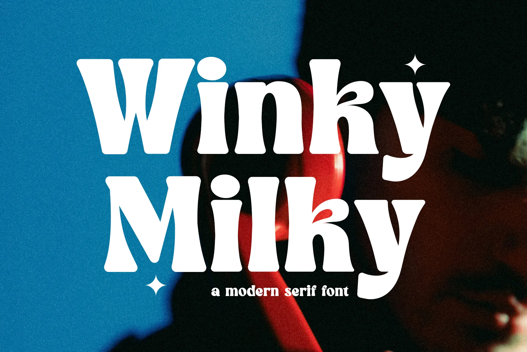
You can see how this font stands out at first glance. This font is very recognizable, thanks to the thick weight that can help to emphasize key points of a design. For this reason, Winky Milky is very suitable for titles, watermarks, or labels.
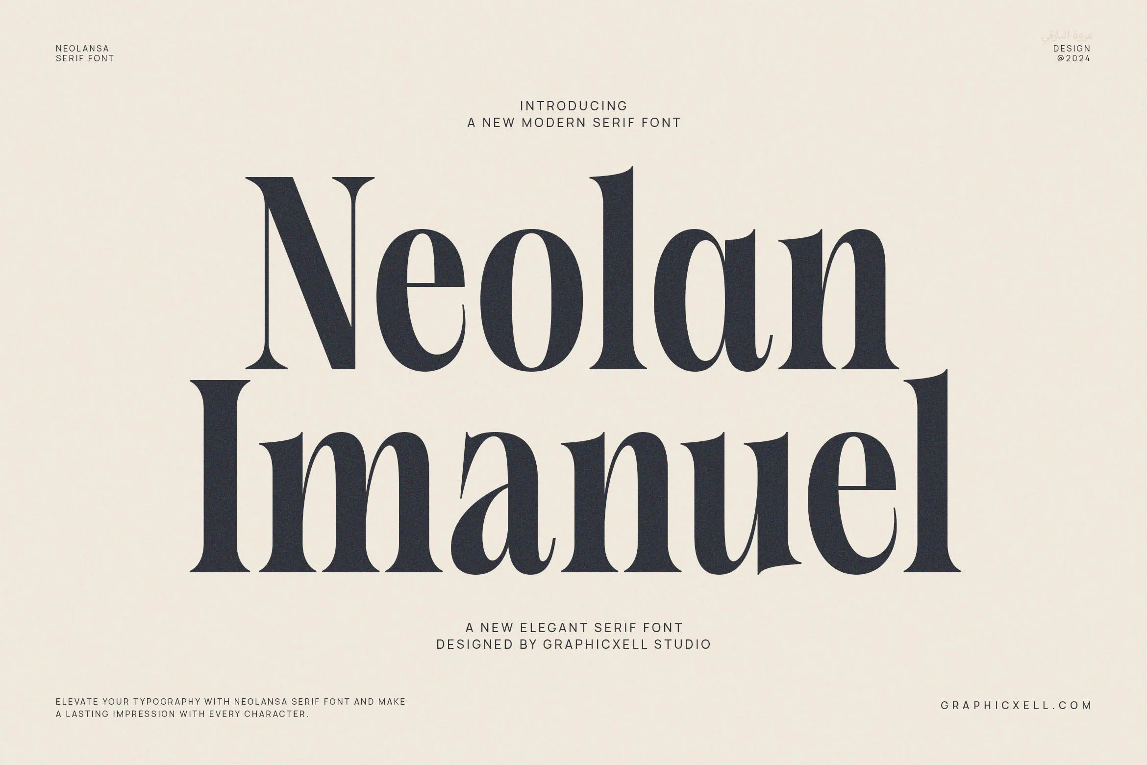
Neolan Imanuel is a serif font that comes in straight letterforms and sharp edges, creating a modern and clean look. You can easily incorporate this font into your retro design, magazines, posters, and any design that requires a strong visual impact.
is a very versatile font to achieve your classic and elegant branding design. The straight appearance of each letter with thin serifs makes this font look clean which is ideal for various purposes, mainly for website design, brochures, and thank-you cards.

is a modern display serif typeface characterized by its thick weight and sharp serifs that will be best for titles, posters, and landing pages. This font is a perfect selection to radiate a minimalist brand identity for its simple and clean shapes.
Morgan comes with a healthy weight variation that is easy on the eyes. The subtle serifs also increase the readability while still establishing a stylish and modern look. This font is perfect for contemporary design that requires a sense of modernity.
Famous is a ligature serif font that radiates an elegant touch, thanks to its unique and graceful shapes. The high contrast between thick and thin weights contributes to the aesthetic appeal that will catch the attention of the audience. This font is ideal for projects with a luxurious and exclusive brand identity.
Overall, serif fonts can be used for a variety of themes depending on the style of the font. Make sure to apply the tips provided to maximize their usage as both a visual aid and aesthetic contribution to your creative design.