
A font can say a lot about a design – a logo, a brand, etc. For example, a typography in a logo that uses serif type can hint at the history of a brand or a company and the message it wishes to convey. Yes, the serif font has its own charm, not to mention distinctive particularities.
Read more to learn about the history and the evolution of serif typefaces, their characteristic, their psychological impacts, and their applications. You will also find some recommendations for the serif font family, more specifically the ones with beautiful ligature style.

Serif font has undergone a remarkable evolution since its initiation in the era of the Roman Empire. It started with stone engravings and metalwork foundations then turned out to be one of the most influential typefaces in human history.
Crafted for beauty and legibility, early serif fonts, indeed, set a standard that lasted through the times. Now, this typeface is adjusting to the technology tides that change swiftly, not to mention diverse design preferences.
The serif font evolution reflects written communication evolution, from the Renaissance’s intricate designs to smooth and shiny modern restatements widely found in digital platforms.
You can differentiate serif fonts from other typefaces by their “serifs”, namely small strokes or lines (or “little feet”) at the ends of each letter or character. Those serifs are not only ornamental but also functionally helpful to guide the audience’s eyes along the text’s lines, enhance readability, and evoke a sense of flow.
You can find serif fonts in several style classifications as follows.
Old-style serifs have the characteristic of bracketed serifs in moderate contrast. Two prominent examples include Garamond and Jenson.
Transitional Serifs mark the move to less bracketing yet much greater contrast. Times New Roman and Baskerville are the two most popular instances.
These serif fonts are easily identified from their thin unbracketed serifs and high contrast, as in Didot and Bodoni.
Slab Serifs feature bold, block-like serifs, famously epitomized by Rockwell and Clarendon.
Contemporary Serifs comprise modern adaptations that combine traditional serifs with innovative styles, generating versatility, especially for digital use.
Serif font is not only about artistically attractive but it also bears psychological traits. This typeface is traditionally associated with reliability, credibility, and authority. That’s why, people prefer serif font when dealing with formal and professional projects or contexts.
You may find further applications of serif fonts in print media and books due to their legibility and classic aesthetics. The serif font works well for branding since it allows feelings of trustworthiness and sophistication regarding brand identity.
Also, thanks to technological developments in screen resolution, modern serif fonts are increasingly more popular in digital designs, especially on digital interfaces.
You have dived into the sphere of the serif font family and uncovered their unique features – their peculiarities. Now, it’s time for practice and application with several recommendations for gorgeous serif fonts with ligatures.
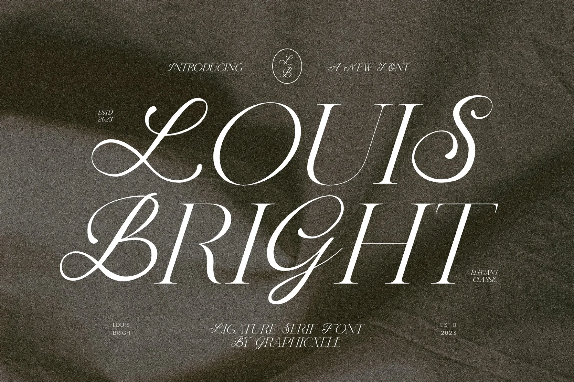
You can tell from the very first glance that Louis Bright is beautiful, unique, and elegant. It is indeed a well-designed ligature serif typeface that has delicate thin lines and strokes. This font also falls under the categories of handwritten, script, brush, and display lettering.
You can also use this font when you want to pursue any creative design with vintage or retro themes. Moreover, Louis Bright has a high level of readability.

Another beautifully charming serif font, Worath is a stylish display font with a distinctive ligature style. This font is simple yet captivating with its delicate counter strokes and decorative ligatures.
The combo of thin lines and ornamental ligatures makes it easier to read the font in any design. An immediate perception or impression you can get from this serif font family is an elegant imprint.
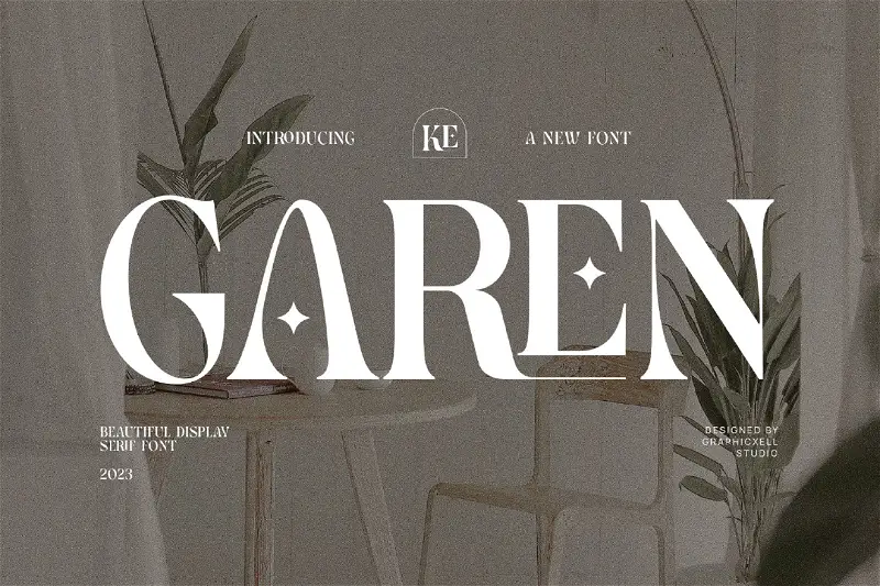
Garen can be your best contender when you’re looking for a beautiful display font of serif typeface that also comes with ligatures. This font offers simplicity that makes it more elegant and legible.
A unique thing you can instantly notice from Garen is the 4-pointed star to replace the stripe. The ligature also plays a brilliant role here, namely evoking an impression of classiness.
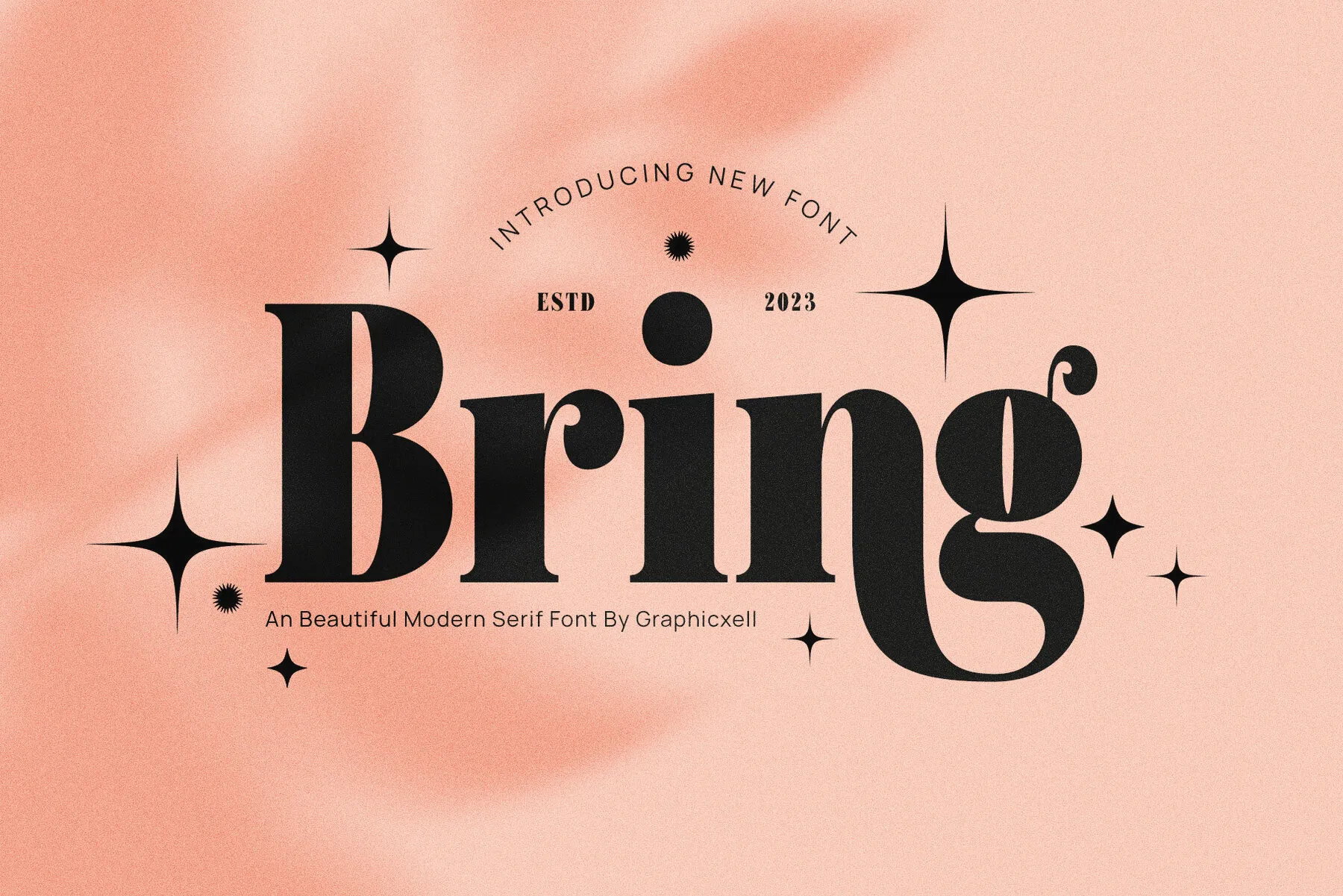
Bold and beautiful. Those are the first impressions you can get from Bring Font. It belongs to a modern serif font whcih has smooth curves and lines, as well as ligatures, in different levels of thickness.
Offering a combo of classy and modern style, Bring is perfect for any creative project, including beauty, wedding, magazine, etc. This font also works well for vintage-themed design ideas.

Mistar adds a great option for beautiful serif font features with a fine-looking ligature style. This font has distinctive ligature-styled letters or characters that are smoothly and delicately connected.
You can apply this font to any design project that has elegance and luxury vocabularies in it. They are suitable not only for modern but also vintage-style themes.

If you want a font that is elegant and timeless, Malken can be the best candidate. This serif font, indeed, offers the return of nostalgia vibe, thanks to its retro-inspired aesthetics. One of its charms is the slightly irregular shape with lines in thin and thick parts that are perfectly connected.
The ligatures, including the rigid and flexible lines – are also brilliantly crafted and blended without compromising the readability.
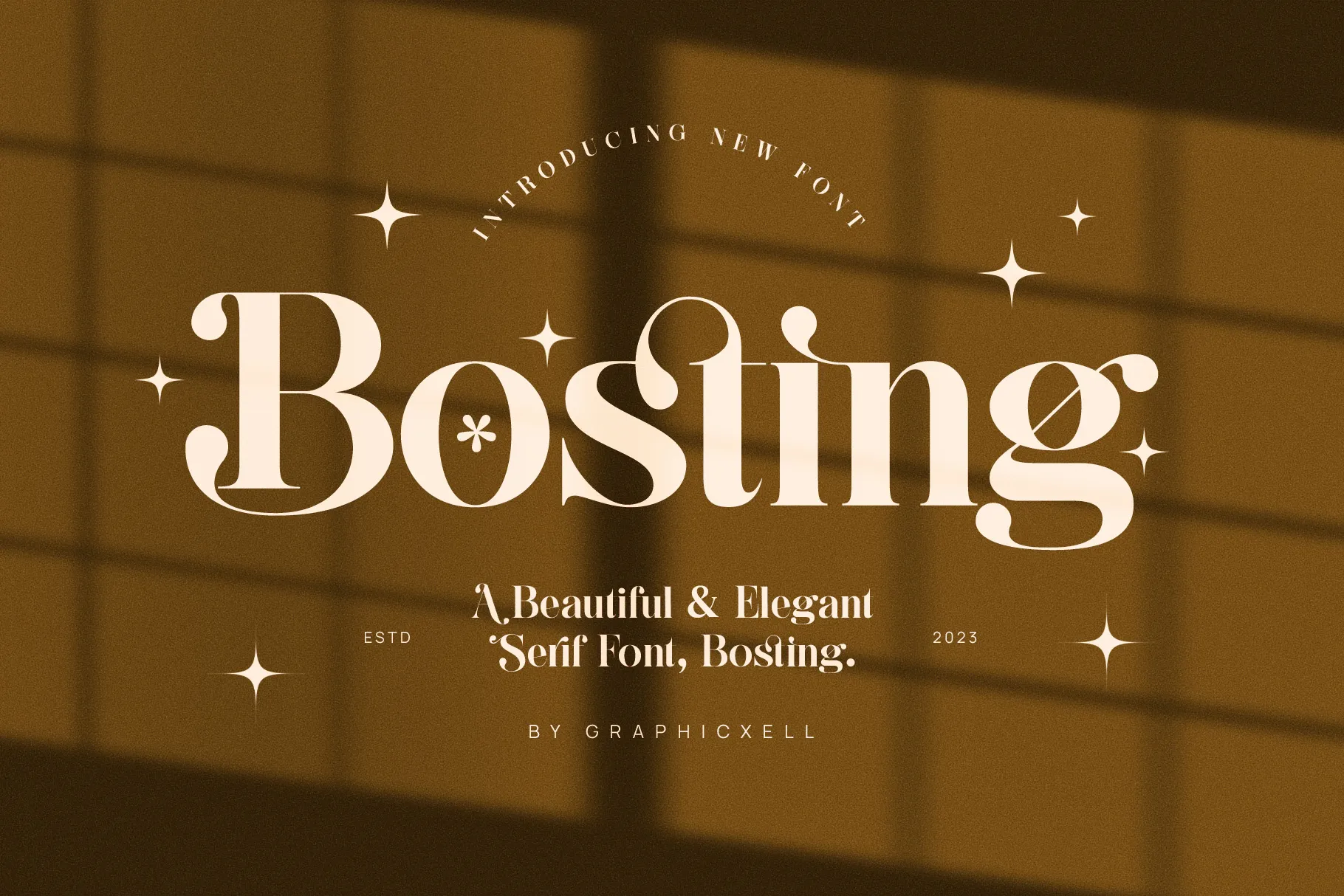
Bosting gives a striking visual attack from the start, in a good way. This font is both calligraphic and minimalist at the same time. Focusing on arresting counterstrokes, some of them are pointed and some others are beautifully rounded.
You can find traces of classic and modern styles in this elegant ligature serif font. In this case, the classic style invokes a more traditional but luxurious look, allowing reliability and stability perceptions.
Bosting closes the recommended list of beautiful serif fonts with ligatures. It is safe to conclude that serif fonts have their own typical beauties and characteristics – peculiarities – that have made many people choose them to incorporate in typography and design.