
Electronic magazines or e-zines have long become a staple of the modern digital world. An alternative to the traditional printed ones, e-zines offer a flexible, convenient way to access information. E-zine is also a good way to access information around specific themes or promote your organization and business.
Just like any media, a good e-zine needs to be visually compelling to attract readers. You can achieve it by designing an eye-catching, attractive e-zine cover.

Like its traditional version, an online magazine cover needs to do two things: attract and inform.
A good e-zine cover must have a neat, non-confusing layout that shows you what to expect inside. You need to combine the right font (such as modern serif font) with color schemes and different text elements. Readers must be able to distinguish the title, featured articles, and supplemental materials.
E-zine cover for a specific institution, business, or organization should also reflect the nature of their work. An e-zine cover art for a design institution, for example, must have a distinctive look that makes it different from a business e-zine.
Just like the design convention of a magazine, a good e-zine cover design should have these elements:
All magazine covers must have a masthead: the main title of the magazine on top of the cover. A good masthead for any e-zine should use a font that reflects the nature and theme of its content. For example, a marketing e-zine’s masthead would look very different from a bridal one.
The cover image boosts the visual attraction of the e-zine and immediately informs readers what to expect. The cover image can be taken from a feature article in the e-zine or a photo or illustration that reflects the main theme.
Unlike books, magazine covers often give enough hints about what’s to come when readers get one. Titles and short descriptions of the main articles are often placed on the cover. Meanwhile, the featured article is given more visual prominence, such as using a larger, more distinctive font.
Understanding the design elements of an e-zine cover art is one thing, but how can one create a good one?
David McKendrick, a designer responsible for artistic covers of TYPEONE magazines, emphasizes distinction. Instead of making the e-zine look like any other magazine, you should be bolder in adding interesting visual elements. Make the public intrigued about what’s inside the e-zine.
Every visual element should attract the interest of future readers. From using a fresh, modern serif font for the masthead to choosing a unique illustration instead of a regular portrait photo, there are many ways you can use to make your e-zine more attractive.
Finally, despite the unique and intriguing elements, do not forget about the basic design principle of a magazine cover: balance between all the elements. While you can reveal as little or as much on the e-zine cover, major elements like color combination, contrast, and font must contribute to clarity and attention at once.
Modern e-zines can benefit from using various modern fonts, which make the design fresh and distinctive. Choosing the right fonts would also determine the right “atmosphere” of the cover design, depending on the theme of the e-zine.
Here are several recommendations of modern fonts you can use for e-zine covers.

Bakilda Histori is a beautiful serif font with the perfect elements for a stylish e-zine. It is easy to read, smooth and seamless, and perfect for the masthead or feature article. Bakilda Histori also comes with standard and italic versions, with unique ligatures that add stylish elements to the typography.
Bakilda Histori is perfect for various e-zines, such as art, design, culture, and culinary. It is artistic but does not take away from the readability factor.
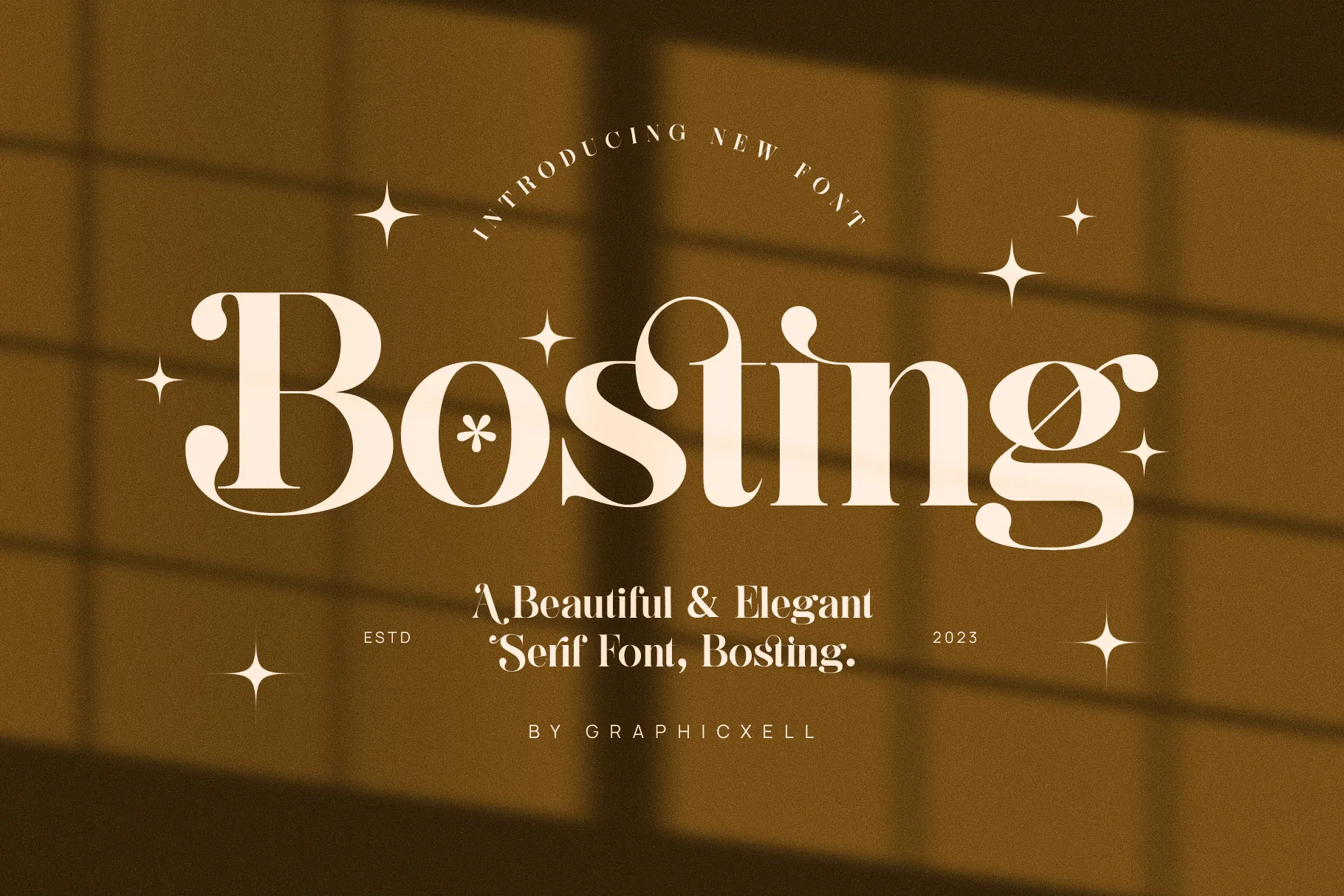
Bosting is a modern serif font with an air of class and elegance. It has medium strokes with various thicknesses and thin, pointed serifs. The overall style exudes importance and prestige, but still with warmth and softness. It also has subtle but elegant ligatures.
Bosting is ideal for e-zines on various topics such as fine dining, artistic events, home and decorations, and travel. It is sophisticated without feeling too fussy.

Neolan Imanuel is sharp and distinctive without losing its elegance. This serif font has a slightly condensed form with pointed peaks and serifs. The result is a subtle Gothic form that makes your typography look exceptionally distinctive. Despite being a modern font, Neolan Imanuel has a unique vintage touch.
Neolan Imanuel is a great font for e-zines about fashion, interior design, luxury lifestyle, and vintage cars. It makes the masthead and main titles of your articles more noticeable. Neolan Imanuel also adds a strong personality to the e-zine.
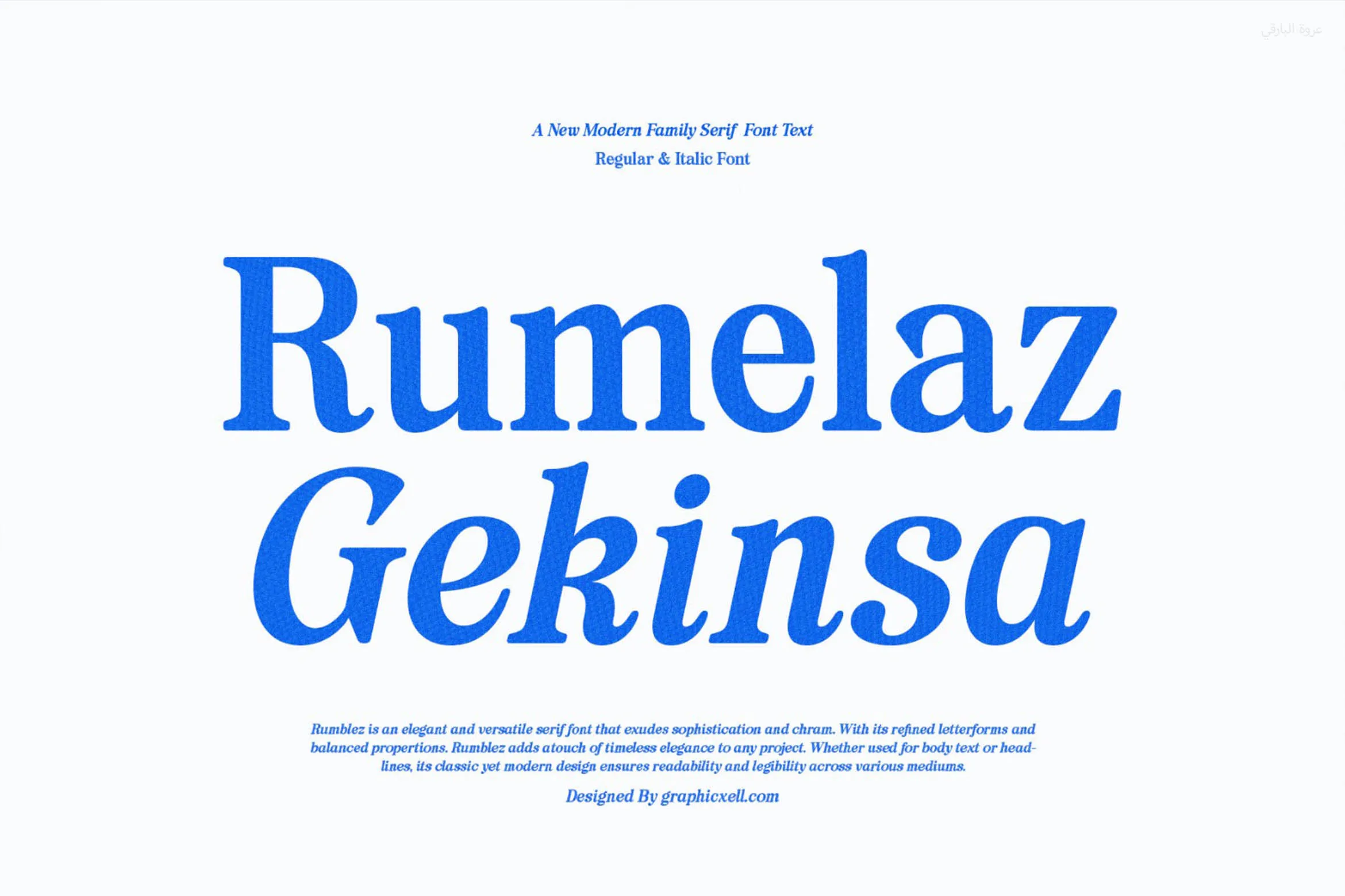
Rumelaz Gekinsa is a modern serif font with a more seamless, straightforward look perfect for various e-zine themes. The typography is smooth and clean, resembling the type of text you would see in newspapers and other printed mass media—a perfect font for masthead, title, and body text.
Rumelaz Gekinsa is a flexible font that is useful for various e-zine themes. You can use the font to create e-zines about art, literature, design, social issues, culinary, property, etc. The regular and italic versions add the modern elegance in an e-zine.
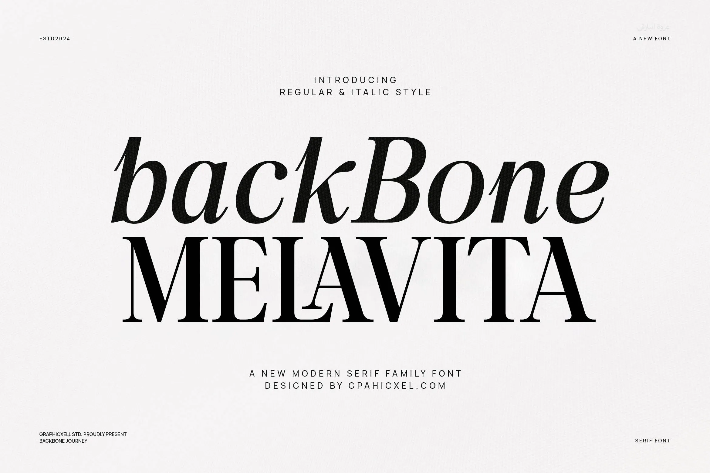
Back Bone Melavita offers regular, italic, and special ligature versions of the same font, giving you more freedom in designing an e-zine. The design is clean, straight, and non-fussy, with short serifs that make the texts easier to read without distracting the eyes. Back Bone Melavita can be used for the masthead and featured article titles.
Back Bone Melavita is a versatile modern font that you can use for various e-zine themes. From business, economy, and finance to social issues, art, and design, Back Bone Melavita is an easy option for any e-zine topic.
A stylish e-zine requires many design elements to blend perfectly, including the fonts. Use these modern serif fonts to create an e-zine cover art that perfectly reflects its theme.